In my previous tutorial I dumped all of the flex diagrams in one place to show you flex box bird’s eye view — but it’s not enough.
JavaScript TeacherAug 3, 2018 · 6 min readCSS Visual DictionaryContains visual diagrams for every single CSS property in common use.medium.com
To get a good idea of how flex works try flex layout editoron this page.
If a picture is worth a thousand words — how many more animation? Flex cannot be efficiently & fully explained by text or static images. To cement your knowledge of flex I created these animated samples.
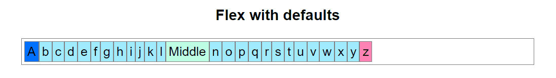
By default flex will not wrap your items. It works a lot like overflow: hidden;
The first thing you will probably learn about flex is flex-wrap.
Flex Wrap
Let’s add flex-wrap: wrap to see how that changes flex item behavior.
Basically — it will simply expand container height and wrap items down a line.
Note: container height is not specified (auto / unset) but still expands.
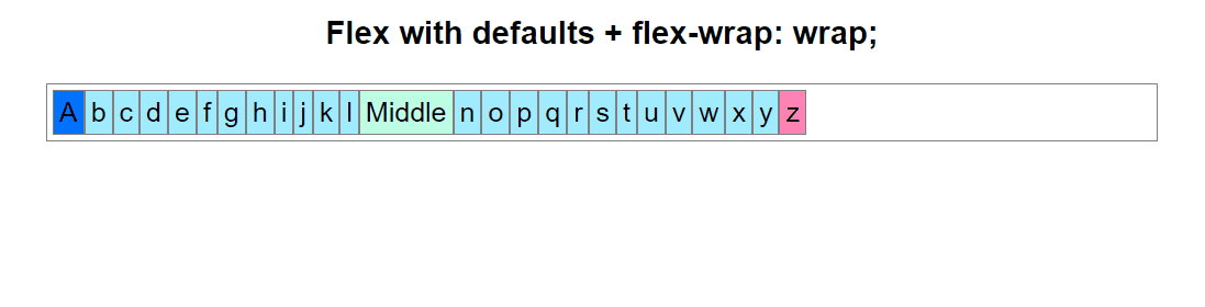
This is a common pattern when you have an unknown number of items with unknown content size and you want to display them all on the screen.
Reverse actual order of items with flex-direction: row-reverse.
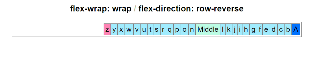
Perhaps this can be used for content with right-to-left reading order.
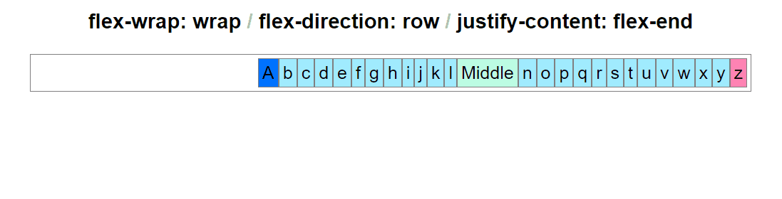
You can “float:right” all of your items that fit on the same line with flex-end.
This is different from row-reverse because the order of items is preserved.
Order is reset per line whenever item breaks occur.
Justify Content
The justify-content property determines the horizontal align of flex items.
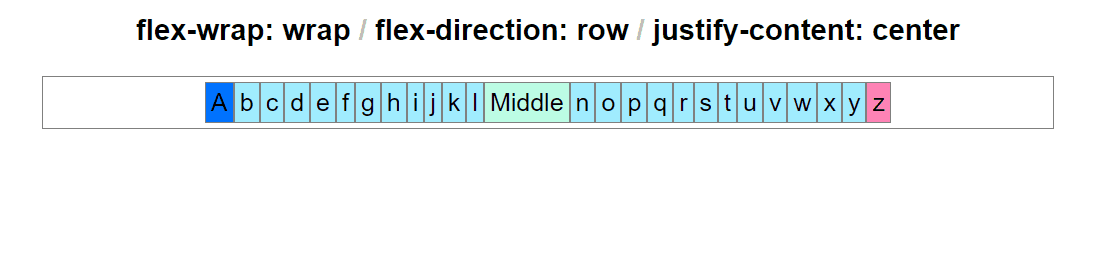
It looks a lot like the previous example… except the item order is preserved.
In the following example (justify-content: center) all items will naturally flock to center of the parent container — regardless of their width. It’s similar to position: relative; margin: auto on regular elements.
Space between means that there is space between all inner items:
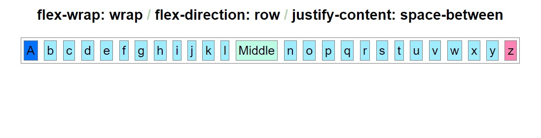
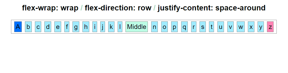
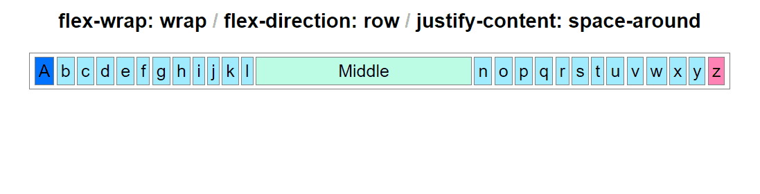
This next one seems almost identical to the one above. That’s because it’s an entire alphabet we’re looking at here. With less flex items, the effect would appear more distinct. The difference is margin on the outside of corner items.
Property space-between (above) has no outer margins on corner items.
Property space-around (below) creates equal margins around all items.
The next is the same example but with a wider middle element.
As you can see here. you still have to experiment with flex in the context of your own content in order to achieve results that make sense for your layout. This is why I decided to make this tutorial. Even animated examples are limited to item size. Your results may differ based on your content dimensions.
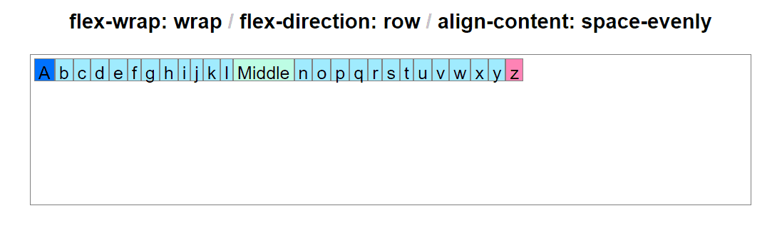
Align Content
All of the examples above dealt with justify-content property. But you can also align things vertically in flex even when it comes to automatic rows.
Properties justify-content (all examples above) and align-content (below) take exactly the same values. They just align in two different directions: vertical and horizontal with respect to the number of items stored in flex container.
Let’s explore how flex handles vertical align…
A few observations about space-evenly:
- Flex automatically allocates enough vertical space.
- Rows of items are aligned with equal vertical margin space.
Of course you can still change height of the parent explicitly and everything will still be properly aligned.
Real-Case Scenario
In an actual layout you will not have a bunch of alphabet letters in a straight line. You will be working with unique content elements. I just wanted to quickly demonstrate how flex works by animated examples up to this point.
But when it comes to actual layouts, you will probably want to start using flex with less items that are larger in size. Something that resembles actual website content.
Let’s take a look at a few ideas…
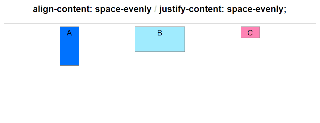
Combining Vertical Align and Justify Content
At some point you’ll probably need your content to be center-justified.
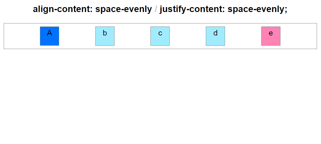
Space Evenly
Using space-evenly for both align-content and justify-content will produce the following effect on a set of 5 square items.
When it comes to out of the box responsive areas with flex… first make sure to keep the width of your items the same wherever possible.
Note that because the number of items in this example is odd (5) this case will not produce an ideal responsive effect you’re probably looking for. Using even numbers can solve this subtle problem. Consider same flex properties working together with an even number of items:
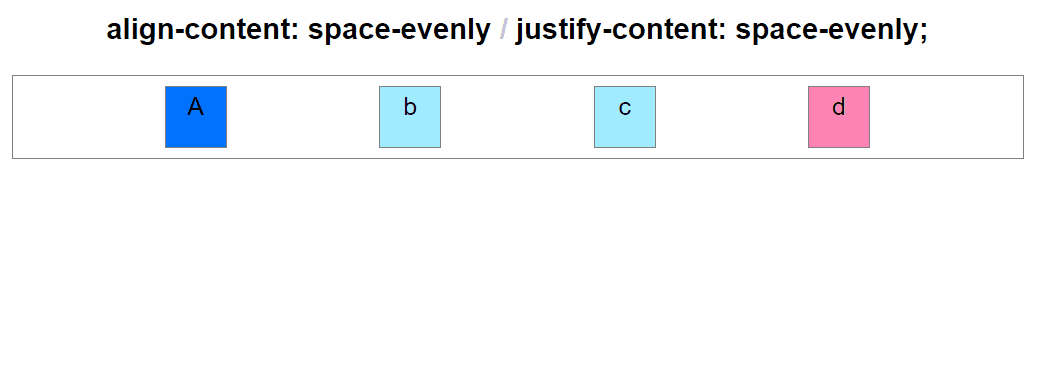
Using an even number of items you can achieve cleaner responsive-like scaling without having to use CSS Grid or JavaScript magic.
Centering items inside an element vertically has been a huge problem in layout design for over a decade.
Finally solved with flex. (Uhh.. you can do it in css grid too.)
But in flex using space-evenly value in both dimensions will automatically space your contenteven with variable item height:
Above is the depiction of the most commonplace use of responsive flex and for the next 10 years (joke.) If you are learning flex you will discover that this is perhaps the most useful set of flex properties in general.
And finally here are all possible values in one animation:
flex-direction: row; justify-content: [value];
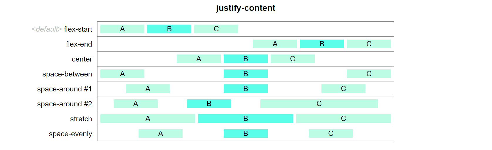
flex-direction: column; justify-content: [value];

It is recommended to use these types of flex items inside CSS grid.
(You’ll naturally figure that out the more you use grid + flex)
But there is nothing wrong with flex-only layouts either.
Make Sure To Specify Element Size Explicitly
If you don’t do that, some flex scaling will simply not work.
Use min-width, max-width and width accordingly.
These properties can make a difference on your whole flex scalability.